Tendenci 7.4.0 Release Notes

Release Summary

The team at Tendenci has been working to make improvements to our T7 software.  The batch of updates noted in this release are mostly centered on:  the Tendenci Nav, Reports, and Newsletters.  You can look for these changes on your T7 site.

Notable changes:

  1. New top menu (for both admin and logged in users)
  2. Newsletters format update and clone feature
  3. Reports format update (including invoices, memberships, ..)
  4. Events views – Added sub menu for month view, week view, day view
  5. Separated join approval and renewal approval for membership notices
  6. Wysiwyg editor – Enabled the image title input field in the image dialog. Added class dropdown to the tinymce link dialog box
  7. Updated the directories categories to make it easy manage
  8. Added drag-drop functionality to the testimonials
  9. Added memberships overview report
  10. Added a link on Profile page to view past events.
  11. More minor changes

Fixes:

  1. (Security) Disabled GZipMiddleware to prevent BREACH attacks
  2. (Security) Prevent fraudulent simultaneous reuse of PayPal transactions
  3. Resolved the issue regarding manage.py hangs when caching is enabled. Re-enabled the cache for site settings.
  4. Resolved the subprocess venv issue.
  5. Fixed exports for directories, jobs, resumes, pages.
  6. Fixed “Most Viewed Files” report.
  7. More fixes

Tendenci Nav

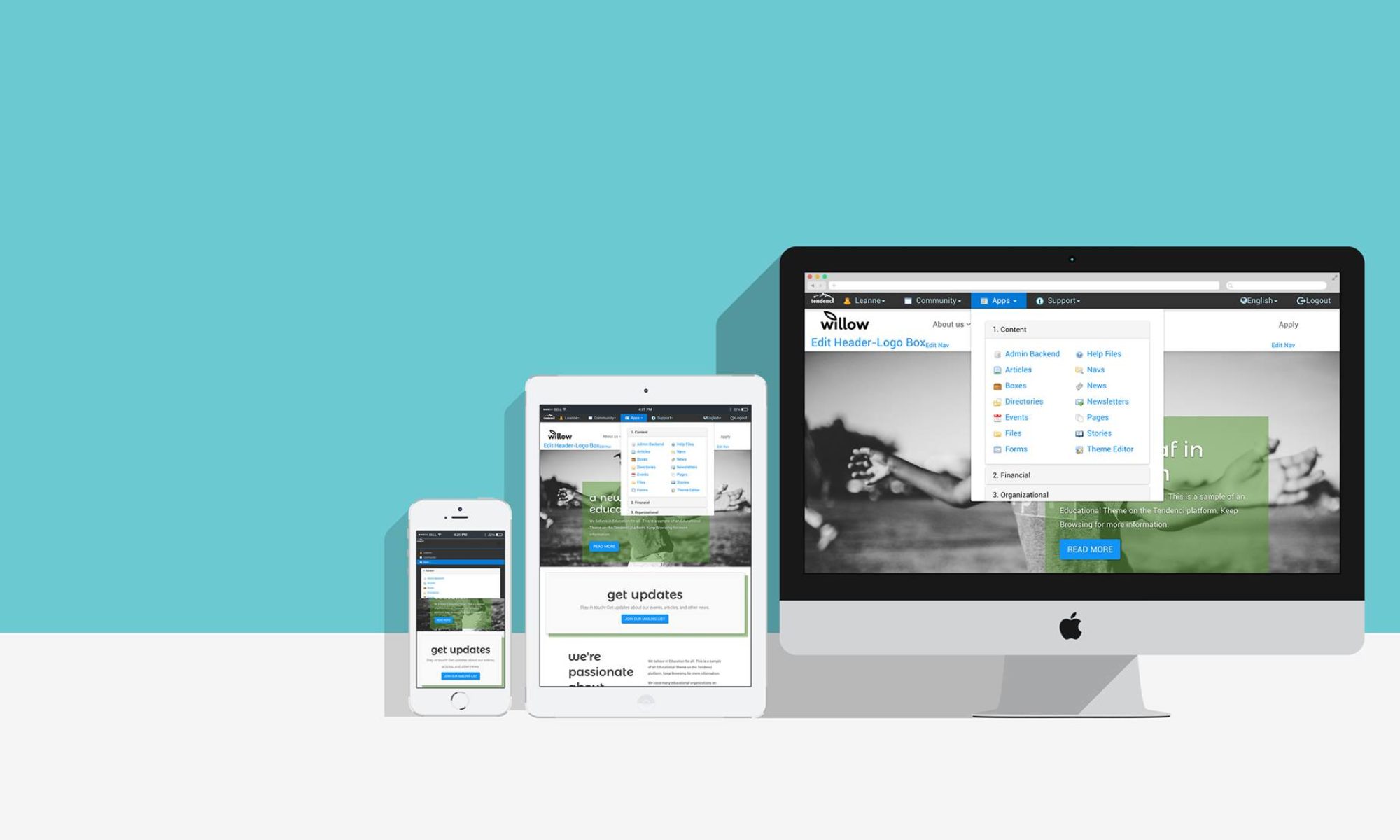
The Tendenci Nav has been reorganized to help you find what you’re looking for.  We hope you’ll take the time that review your new Tendenci Nav and get familiar with some of these changes.  Here’s a screenshot of what it should look like:

*For all of these updates, some sites will display slightly different fonts and design features based on the site theme. 

Tendenci Nav Screenshot T7
Screenshot of the new Tendenci Nav in T7

Reports

Updates in the Reports module includes consolidation of all reports into their own Tendenci Nav item.

Reports Screen shot Tendenci Nav


This release also includes an update to the Invoices module, making invoices faster to browse visually in a table-based format.  To view invoices in the new navigation on your site, click: Reports > 5. Financial > Invoicing.

Tendenci Invoices Screenshot
New Tendenci Invoices Screenshot

Newsletters

The Newsletters module works almost exactly the same as before.  We have made a few features a little bit easier to use.  For example, if you’d like to re-assign the newsletter to a different group, you can now do so even after you’ve generated the Newsletter in the first step.  We’ve also made some layout improvements that take advantage of Bootstrap’s framework.

The “clone” feature has also been added to this module.  With clone, you can send a test e-mail, then clone it and send it to your target audience rather than copying and pasting the contents from the first send.

Screen shot of Tendenci clone feature in Newsletters
Screen shot of Tendenci’s new “clone” feature in Newsletters

Have software updates you’d like to share?  Fork us on Github!

Special thanks to @PaulSD for lots of fixes and update!

Facebook Makes Sharing Easier

So, I’ve gotten to the point where I don’t consider it a real week unless Facebook has made some sort of major interface change I have to adapt to. Don’t get me wrong; change is good, but sometimes it’s exhausting, and sometimes I don’t love the changes. Today, however, I’m happy to explain a User Interface change that I’m sure we will all agree is, well, just swell.

Inline Privacy Settings

Facebook has moved many of its privacy settings inline! Here, let me explain.

Before these changes were implemented, if you wanted to edit who in your friends lists could see what on your profile (i.e. Status Updates, About Me, Hometown, etc.), you had to comb through lists of options buried deep in your account settings. It was cumbersome to say the least. Now, these settings are visible right next to the piece of content you’re editing. Take a look:


Tag Approval

You remember that time you said you couldn’t make a your cousin’s wedding because you didn’t feel well, then your friend tagged you in a photo dancing on a table that same night, and your family was, like, SUPER mad? That’s not a thing anymore guys. You get to approve photo tags before all your friends see your indiscretions. You’ll simply see a Pending Posts link beneath the “Wall” link on your profile, where you’ll be prompted to approve the posts.

But wait!. . . There’s more! You’ll also be given the ability to approve tags that other friends try to add to your photos and posts. I feel liberated already.

That’s not all folks! You’ll also have more choices when removing  a tag someone else added. Choices include: a.) Remove tag, b.) Ask friend to take photo down, c.) Block friend. It’s like choosing the flavor of mustard I want from the store; I’m paralyzed with indecision.

Impersonation

So you spent forever splitting up your 4,500 friends up into appropriate lists so that you know that you’re sharing the right content with the right people, right? But you could never be certain the settings all worked the way you wanted, especially since they change so frequently. Now you can. Introducing. . . the “View Profile as” button!!! (applause roars in the background). This lets you impersonate any of your Facebook friends, so you can see what they can see.


Status Update Modifications

Status updates just got cooler, y’all. There are a couple nice new features to note:

1.) You can tag locations from your posts. Before, you had the check into a location from your smartphone using the Places feature. Now, you can search locations right at the status update field. Apparently, Never Never Land is a place.

2.) All media uploads are consolidated under Add Photo. I think this provides a cleaner, simpler interface.

3.) The Share Link feature is gone, now all you have to do to share a link is copy/paste the URL into your status update. You’ll get the same result.

All these updates boil down to a simpler, cleaner interface, more accessible privacy controls and more intuitive status update box. I heart all of these changes. What do you guys think?

Google search page gets a facelift

We love seeing well though out updates to tools we use regularly.   Google’s latest search page re-design makes finding the content online you want even even easier.   While many of these features are not exactly new, it’s nice to see them placed a bit more in the forefront so many might be new to you!

Here are a few Google search options to know about – you can click on the image above to blow up our labeled screenshot or watch this handy video to learn from the mouths of Google all-stars themselves:

  1. Universal Search options – the Web is an enormous place and narrowing down what you’d like to search through can make it easier for you to find relevant content.   Search through the entire Web, news items, blogs, images and more.   Your time is valuable and Google is helping you reclaim some of that 🙂
  2. Set your preferred timeframe – if you only want content added recently or want to take a step back in time and look up Web site results from 2009, Google helps you make it happen.
  3. Location location location – given how important location-based marketing is these days, Google lets you   select where your information is coming from and that doesn’t just mean geographically speaking either.   You can also select to search your ‘social circle’ on Google for content, which will pull in links from you Google chat pals and contacts, direct connections linked from your Google profile and even content from your Google Reader feeds.   Learn more about Google Social Search here.
  4. New or re-visited sites, you decide – sometimes you’re hungry for something new and refreshing.   If you don’t want to go back and visit sites Google knows you’ve already visited, you don’t have to.   Here’s to new adventures!
  5. Pick your view, any view– Google even lets you customize your own search results page view:
    1. The Google Wonder Wheel breaks down your search term into different categories or clusters, giving you some more search ideas
    2. Google timeline gives you a different view of search results, for the more linear-minded
    3. Related search gives you extra search ideas that may help you find the information that you need (hey, we could all use a little help now and then)
  6. Something different – Google is pretty darn smart and these ‘something different’ search options might help give you an extra boost into other search possibilities in a similar category of your original search.

Tendenci newsletter editor live – check out our help files!

 _toolbar

Our updated Tendenci newsletter editor is up and running today!  Check out some of the cool features in this great new version on our newsletter editor announcement post here.

Want to switch back to the old editor until you get used to it?  No problem, check out our help file here.  Worried about your spelling prowess?  Never fear, check out this help file on how to activate spell check in the new newsletter editor!  

Let us know what you think about the new editor, it is currently only live in the newsletter editor – so check it out next time you send out another snazzy email to your Community!