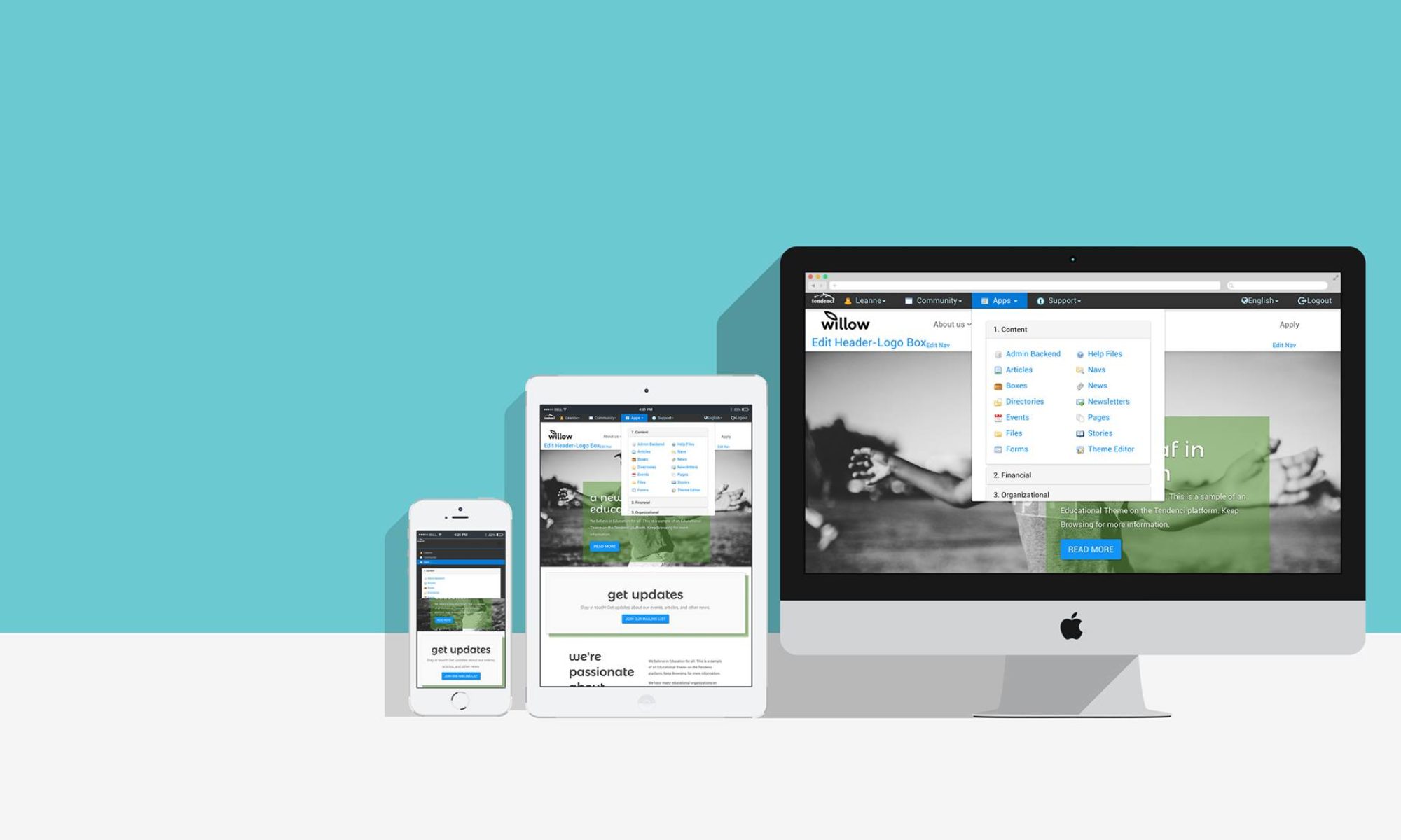
Tendenci websites include all the tools your nonprofit organization needs to create a website that will attract donors, volunteers and members and make it easy for them to get involved.
According to a study published in the NonProfit Trends, 34.8% of last year’s online donations occurred after October, November and December. For most nonprofit organizations, the Holiday Season are when you generate the majority of your annual online revenue from donations, holiday gala fundraisers, and membership renewals coming due.
Is Your Website Ready for the Holiday Rush?
If your nonprofit’s online fundraising isn’t performing as well as you’d like, you aren’t alone. A recent Usability Study of nonprofit websites found that it is 7% harder, on average, for someone to make a donation than it is for them to make an e-commerce purchase.
In this two part blog post, I’m going to share the research on which elements are frustrating and driving away potential donors who come to your site and can’t find what they were looking for. The second post will give you 5 minor changes you can quickly make that will get your website ready well to attract new donors just in time for the holidays.
Nonprofit Site User Experience is Falling Behind

The usability study, led by noted web usabilty expert Jakob Nielsen, tested common activities that a visitor to a nonprofit website might do and found some surprising results:
- Making first-time and repeat monetary donations on nonprofit websites – on average, online donations tooks 7% longer than a typical e-commerce site’s shopping cart check-out. 17% of the nonprofit websites made it extremely difficult for visitors to even find the online donation option.
- Donating tangible items like furniture, canned foods, and used clothing online – this received the lowest user experience rating of all the tested activities and in nearly all cases, site visitors went to multiple nonprofit websites before finally finding an organization with clear and complete information on how to go about donating.
- Researching how to volunteer online – communicating Volunteer information was the one thing most nonprofit websites are getting right. The study gave this the highest user satisfaction ranking and reported that the one item most nonprofits forget on the volunteer pages is way to contact the organization.
- Researching nonprofits on Facebook – the study found that people don’t like to donate on Facebook and that visitors except a nonprofit’s website to have far more content than your Facebook page does. The report explains that potential donors go to a nonprofit’s Facebook page to read the stories of the people who benefit from the nonprofit’s work.
The study showed that over 53% of the nonprofit websites had missing and outdated content and 47% of the websites were not designed to be intuitive and user-friendly. The report states that you could increase your online donations by 10% or more just by making some minor changes to your site’s usability and improving your content.
A 10% increase is almost $14,000 if you fall within the median online revenue earned from first time gifts*.
*The average online revenue earned from first time gifts in 2011 was about $136,625 according to Nonprofit Marketing Guide *
If your nonprofit site is chasing new donors away, this means you’re missing out on thousands of dollars in online donations.

Is Your Website a Donor Magnet?
If your nonprofit organization’s website is one of the roughly 50% that is unknowingly chasing off site visitors, then we’re going to fix that starting right now. You can use the study’s recommended best usability practices with your Tendenci website to give your site visitors a great online experience and increase your donations, memberships, and volunteer applications.
The key is to have content on your site that potential donors are looking for that is easy for visitors to find and tells the visitors how to donate and why they want to donate to your organization.
Crafting the elements within your site that will attract new donors requires time, research, and lots of creativity!
In Part Two of this series, I’ll give you 5 seemingly minor things that you can change on your site that will increase your online fundraising efforts and get you ready for the holiday fundraising rush.

