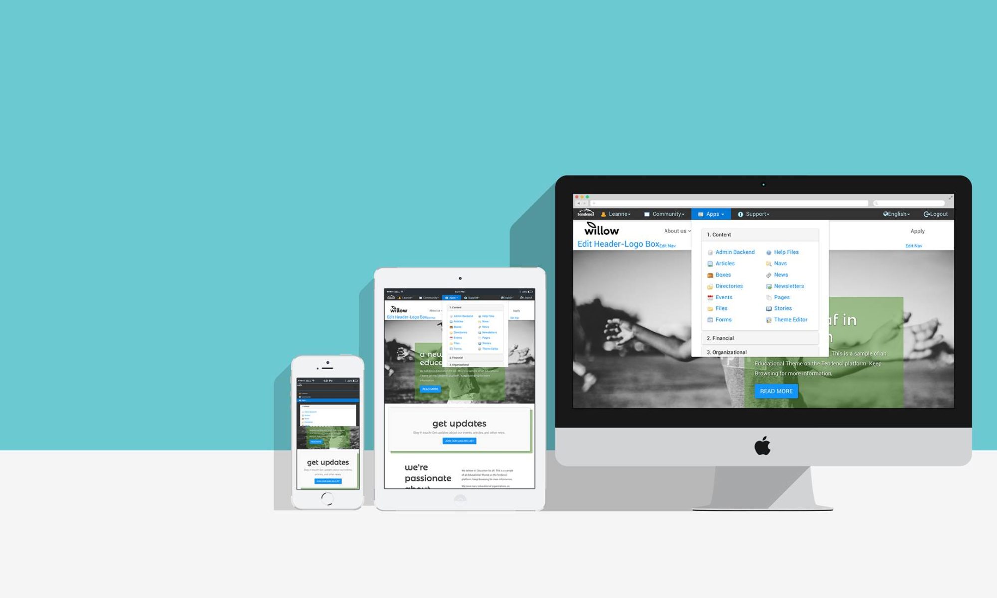
In part one of this 2-part series, I talked about the problems with many nonprofit websites that are driving potential donors away. In the second post, I’m going to give you 5 changes you can make to your website to increase your online donor conversions.
5 Minor Changes You Can Do Today
1) Strengthen your Call to Action
The last thing you want is for a visitor to come to your website looking for a way to get involved and not being able to find the information. Your site needs a clear call to action that asks visitors to become members, donate, or register for an event.

Here’s a great article by the Copyblogger on the common mistakes that marketers make with their web site call to action. Are you making any of these mistakes? If you are, today’s the day you’re correcting them!
2) Make it Easier for Visitors to Sign-Up
Make it as simple as possible for your visitors to convert into supporters on your website. Identify the actions your site visitors take on most often and least often. Then, log out of your site and go through each of those actions from a visitor’s perspective.
As you go through the sign-up process, ask yourself, “How easy is it and how long does it take you to complete a transaction?”, to help you figure out how you could make the process better
Test both the most and least popular actions and then compare the experiences. Sometimes, this activity reveals ways that some actions are complicated and time consuming for visitors and that’s driving potential donors away.
3) Move Your Email Newsletter Sign-up Above the Fold
“Above the Fold” is a term for the portion of a web page that you have to scroll down to view. Think of “the fold” as ending about where you might fold down your laptop screen.
According to another study by Jakob Nielsen, content below the fold is only viewed by about 20% of your total site’s visitors. This means that any content you place below the fold is only going to be seen by 1/5th of your visitors. Important items you want to have above the fold include: your email newsletter sign-up form, a clear call to action, a strong headline and links to find out more about your organization.
4) Give Donors What They Want

Donors want to know more about your nonprofit before they donate. They also prefer to go online to research information about your organization themselves before making a decision to support your mission
Donors want information that communicates what your organization does, how you spend donations and who you have helped.
If you also have memberships, then you want to also consider that new members want to know about member benefits, costs, and find out about programs and events you have for your members.
Learn more about creating engaging content for your website in the presentation Writing for the Web by Katrina Esco, Account Executive on Schipul’s Creative Services team.
5) Use Digital Media to Create Compelling Stories
You know you should use storytelling to share your NonProfit’s Mission and Vision to attract new donors. Crafting great stories can be a challenge. Take photos and videos from your events, of your volunteers and staff, and of the people you’ve helped.
For example let’s look at the homepage for Camp For All, a camp program for kids with a variety of different health problems:

The Camp has a photo of a kid swimming on their homepage and just look at how happy this kid is. This photo shows new visitors that Camp For All is making a difference in children’s lives and that’s far more powerful than if Camp For All had used text to say the same thing.
I’ve written about how to incorporate your nonprofit’s stories with your website. Check out Grow Your Members and Donors with Photo Albums and NonProfit Storytelling with Videos for more examples and tips.

