If you lived through the 70s and the 90s, you know that trends are cyclical.
How many times have we seen bell bottoms and big sunglasses make a come back?
Of course this isn’t limited to fashion. A detailed look into your Google Analytics charts will reveal that your organization has cycles, predicable ones you can plan for.
So how do you read this data and equate the data to your organizations live campaigns?
1) First, collect your data. (Everything you do on a recurring basis including dates). Create an aggregated list of anything involving donor/volunteer/member communication including:
a. Events
b. Newsletters
c. Fundraisers
2) Find your data store. (Google Analytics is free to install and has a lot of useful data.)
3) Choose your relevant date range. I like to look at two or more time frames. Typically a year’s worth of data, a smaller three month period of activity, and a one month period.
4) Run your analytics for the type period then look for patters in your data!
Types of patterns you are looking for are
a. Spikes
b. Sequential Dips
c. Dead Spots
Case Study:
We partnered with one of our clients, a large nonprofit organization, to increase donations an engagement of their audience in nontraditional ways.
To achieve this we turned to the data recorded on their website:
Disclaimer:
The graphs below are pulled from a report in the Tendenci software (the cms software is free for download on https://www.tendenci.com/ – click on “For Developers”). These same practices can be applied with Google Analytics or whatever your analytics of choice is.
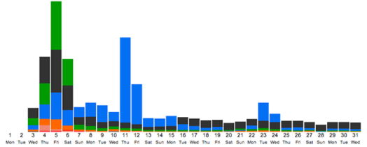
This graph shows site activity grouped by module/plugin (for example any event page that was clicked on during the time period would show up as orange)
This is an engagement graph of activity on a client website.
What we noted:
- We see a huge increase in site visits on the 4th-6th
- Followed by a huge increase in site visits to photos on the 11th
- And then a decrease in site activity after the 12th
So what did we find when we matched up the engagement graph with our dates of activities
Saturday, 6th was a large event
Thursday, 11th a newsletter goes out to members
When we compared to another month with a large event, we found the same graph shape.
The data tells us:
- Before the event and day of we had lots of people on the site looking for information and directions
- After the event we had a dip in activity but we had a lot of people visiting the photo pages to look for images of the event
- The newsletter contained links to the images for the event so we had a huge increase in visits to the photo page.
So what types of actions can an organization take based on this data?
- Have upcoming event information on your website loud and clear. People will be looking for it
- Make sure to be taking lots of photographs at the event – photos generated a huge amount of traffic to the site
- Newsletters or an email post event drive traffic.
- Add a call to action on your photo pages. These pages get huge amounts of traffic post event and people are reliving the experience – make sure there is a call to action to donations or volunteering.
- Engagement is low post event. Brainstorm ways to reengage audience after the event excitement is over.
The patterns are there, you just have to look for them and connect the pieces of the puzzle.
Want more info?
Ed Schipul is the CEO of Tendenci and will be speaking on Data Analytics at NTC 2014 in Washington DC on March 15th (Online Fundraising Strategies to Take Advantage of Your Donor Events)
Photo Attribution (in sequential order):
rchappo2002 “Mr Hicks – 1971”
Betty Tsang “vampire?”
Mick “Super Models and Big Sunglasses”


